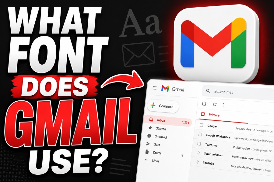
Many users ask what font does Gmail use because Gmail looks clean, simple, and professional on every device. The answer is not only one font. Gmail’s interface uses Google’s modern sans-serif style, while email body text often depends on Arial, Roboto, Helvetica, or fallback fonts.
This matters for writers, designers, and email marketers. If you want your email to look polished in Gmail, you should understand how Gmail handles fonts, default text, and fallback options. A good font can improve readability, trust, and the overall user experience.
What font does Gmail use?
Gmail’s interface mainly uses Google Sans-style typography. For email writing and message body text, Gmail often displays Arial, Roboto, Helvetica, or a generic sans-serif fallback depending on device, browser, and email formatting.
Gmail Interface Typography and Default Typeface
Gmail’s interface uses a clean sans-serif style that matches Google’s wider product design. This includes the inbox, sidebar, buttons, search bar, labels, and menu text. The interface is commonly connected with Google Sans-style typography because it feels modern, rounded, and easy to read.
When people ask what font does Gmail use, they usually notice this interface first. Gmail does not look decorative or heavy. It uses simple letter shapes, clear spacing, and soft visual balance. This makes the inbox easier to scan, especially when users deal with many emails every day.
Google Sans-style fonts work well for Gmail because they support fast reading. The letters are smooth, clean, and friendly. They also match other Google products such as Google Drive, Docs, Calendar, and Meet.
However, the exact font may appear slightly different depending on your browser, operating system, and device. Gmail’s interface is designed to stay consistent, but text rendering can vary between desktop, Android, and iPhone.
In short, Gmail’s interface uses Google’s modern sans-serif font system. It is built for clarity, speed, and a familiar Google-style experience.
Gmail Email Body Font and Message Text Style
Gmail Email Body Font and Message Text Style refers to how Gmail displays the text inside your emails. Gmail usually uses a clean sans-serif style for easy reading, but the final font can depend on the sender’s formatting, browser, device, and fallback font settings. This is why email body text may appear as Arial, Roboto, Helvetica, or another simple sans-serif font.
Gmail Compose Font
When you write an email in Gmail, the default text usually appears as a simple sans-serif font. In many cases, it looks similar to Arial or Roboto. Gmail keeps this font plain because emails need to be readable across many devices and inboxes.
Gmail Fallback Font
If Gmail cannot display a chosen font, it uses a fallback font. A fallback font is a backup font that keeps the email readable. Gmail commonly falls back to safe sans-serif fonts such as Arial, Helvetica, or a system default.
Sender Formatting
The font inside a received email can depend on the sender’s formatting. If an email marketer uses HTML code, Gmail may try to show the chosen font. If the font is not supported, Gmail replaces it with a safer option.
Best Practical Answer
So, what font does Gmail use for email body text? The best answer is Arial, Roboto, Helvetica, or a generic sans-serif fallback. The final font depends on the email design, device, and browser.
Why Does Gmail Use Sans-Serif Fonts?
Gmail uses sans-serif fonts because they are clean, modern, and easy to read on screens. Email is a fast-reading space. People scan subject lines, sender names, preview text, and message bodies quickly. A simple font helps users understand information without extra effort.
- Sans-serif fonts improve readability.
They look clear on desktop and mobile screens. - They help users scan faster.
Gmail users often move through emails quickly, so clean letters save time. - They feel modern and professional.
Gmail avoids decorative fonts because they can distract from the message. - They work better on small screens.
Mobile Gmail needs fonts that stay readable in tight spaces. - They support Google’s brand style.
A clean font helps Gmail feel connected to other Google products. - They reduce visual clutter.
Simple typography keeps the focus on the email content.
Best Gmail-Friendly Fonts for Email Design
If you design emails, you should use fonts that display well in Gmail and other major email clients. A beautiful font is not useful if Gmail replaces it with something unexpected. That is why safe font choices matter.
The best Gmail-friendly fonts include Arial, Helvetica, Roboto, Verdana, Georgia, Times New Roman, and Tahoma. For most business emails, Arial or Helvetica is the safest choice. They are simple, readable, and widely supported.
A good font stack for Gmail emails is:
font-family: Arial, Helvetica, sans-serif;
For a more modern Google-style look, you can use:
font-family: Roboto, Arial, Helvetica, sans-serif;
This means Gmail will try to show Roboto first. If Roboto is not available, it will use Arial. If Arial is not available, it will use Helvetica or another sans-serif font.
If you are asking what font does Gmail use because you want a similar design, do not focus only on the font name. Also use short paragraphs, clear headings, enough white space, and readable font sizes. A Gmail-like email should feel clean, calm, and easy to scan.
How to Choose the Right Font for Gmail Emails
Use Simple Fonts First
Simple fonts are best for Gmail emails. Arial, Helvetica, and Roboto work well because they are readable and professional.
Keep the Font Size Readable
Use 14px to 16px for body text. Small text may look neat, but it can be hard to read on mobile.
Avoid Too Many Fonts
Do not use many fonts in one email. One main font family is enough. You can create variety with bold text, headings, and spacing.
Always Add Fallback Fonts
Fallback fonts protect your design. If your first font does not load, Gmail will show the next available font.
Test Before Sending
Check your email in Gmail desktop and Gmail mobile before sending. This helps you find font, spacing, and layout problems.
Conclusion
So, what font does Gmail use? Gmail’s interface uses Google’s clean sans-serif design style, often associated with Google Sans. For email writing and body text, Gmail may display Arial, Roboto, Helvetica, or another sans-serif fallback.
For the best email design, use simple fonts, readable sizes, and safe fallback stacks. A Gmail-style font choice should make your message easier to read, not just nicer to look at.
FAQ’s
What font does Gmail use by default?
Gmail uses a clean sans-serif style. The interface is linked with Google Sans-style typography, while email body text often appears as Arial, Roboto, or another fallback font.
Does Gmail use Google Sans?
Yes, Gmail’s interface follows Google Sans-style typography. However, email body text may use different fonts depending on formatting and device support.
What font does Gmail use for composing emails?
Gmail’s compose window usually uses a default sans-serif style. It may appear like Arial, Roboto, or a similar system font.
Can I change the default font in Gmail?
Yes. You can change it from Gmail Settings under Default text style. Gmail offers limited font options for regular users.
What is the best font for Gmail email templates?
Arial, Helvetica, and Roboto are strong choices. A safe font stack is Arial, Helvetica, sans-serif.
Why does my font look different in Gmail?
Fonts can look different because Gmail, Outlook, Apple Mail, Android, and iPhone all render fonts in slightly different ways.