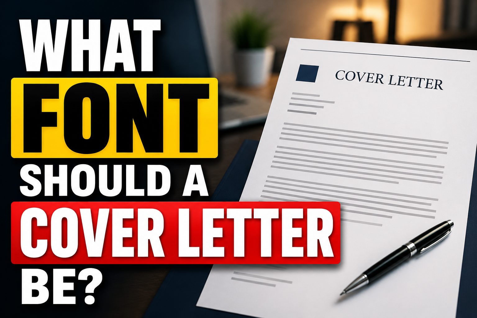
Choosing the right font for a cover letter is important because it affects readability and first impression. A hiring manager may review many applications in one day, so your cover letter should look clean, professional, and easy to scan.
If you are wondering what font should a cover letter be, the best answer is simple: use a professional font that is easy to read on both screen and paper. Fonts like Calibri, Arial, Aptos, Georgia, Cambria, Garamond, Helvetica, and Times New Roman are safe choices.
Your font should not look too casual, decorative, or difficult to read. It should support your message and make your application look polished. Font size, spacing, margins, and file format also matter when creating a strong cover letter.
What font should a cover letter be?
The best answer to what font should a cover letter be is to use a clean and professional font such as Calibri, Arial, Aptos, Georgia, Cambria, Garamond, Helvetica, or Times New Roman. Use 10 to 12-point font size, keep spacing clear, and save the file as a PDF if allowed.
Professional Cover Letter Fonts That Impress Recruiters
A cover letter should use a font that looks clean, simple, and professional. The goal is to make the document easy for the hiring manager to read. A good font helps your application look organized before the reader even starts reading your words.
The best fonts for a cover letter include Calibri, Arial, Aptos, Georgia, Cambria, Garamond, Helvetica, and Times New Roman. These fonts are popular because they are readable and suitable for professional documents.
When choosing a font, avoid anything that looks playful or decorative. Your cover letter is not a poster or invitation. It should look serious, polished, and suitable for the job you want.
Serif vs Sans Serif Cover Letter Fonts
Serif and sans serif fonts can both work well for cover letters, but they create different impressions. Serif fonts often look more formal and traditional, while sans serif fonts feel clean, modern, and easy to read on screens. Choosing the right style depends on your industry, job role, and the professional tone you want to show.
What Are Serif Fonts?
Serif fonts have small strokes at the ends of letters. They often look formal and traditional. Good serif fonts for cover letters include Times New Roman, Georgia, Garamond, and Cambria.
When Should You Use Serif Fonts?
Use serif fonts when applying for traditional industries such as law, finance, education, government, medicine, or business. These fonts can make your cover letter feel serious and professional.
What Are Sans Serif Fonts?
Sans serif fonts do not have small strokes at the ends of letters. They look cleaner and more modern. Popular sans serif fonts include Calibri, Arial, Aptos, Helvetica, and Verdana.
When Should You Use Sans Serif Fonts?
Use sans serif fonts for modern industries such as technology, marketing, media, sales, startups, or design-related roles. These fonts are easy to read on screens and give your cover letter a fresh look.
Best Fonts for a Cover Letter
If you are asking what font should a cover letter be, choose a font that matches your industry and keeps the letter easy to read. The best font is not the fanciest one. It is the one that helps your message look clear and professional.
- Calibri: A modern and safe choice for most job applications.
- Arial: Simple, clean, and easy to read.
- Aptos: A fresh professional font for modern applications.
- Georgia: A readable serif font with a warm professional style.
- Cambria: A polished font for formal and business roles.
- Garamond: Elegant and professional, but may need a larger size.
- Times New Roman: Traditional and acceptable for formal industries.
- Helvetica: Clean, modern, and suitable for professional documents.
Best Cover Letter Font Size and Spacing
The best cover letter font size is usually between 10 and 12 points. An 11-point font is a safe choice for most letters because it is readable without taking too much space.
Do not reduce the font below 10 points just to fit more text. If your cover letter is too long, shorten the content instead. A clear and concise letter is better than a crowded one.
Spacing is also important. Use single or 1.15 line spacing for the body text. Add a little space between paragraphs so the letter does not look too dense.
Margins should usually be around one inch on all sides. This gives the document enough white space and makes it easier to read.
Common Cover Letter Font Mistakes to Avoid
Small font mistakes can make a cover letter look unprofessional, even when the content is strong. Using decorative fonts, tiny text, too many font styles, or poor spacing can hurt readability. Avoiding these common errors helps your cover letter look clean, polished, and easier for hiring managers to scan.
Using Decorative Fonts
Avoid script, handwritten, cartoon, or display fonts. These fonts can make your cover letter look unprofessional and hard to read.
Using Very Small Text
Do not use tiny font sizes to include more information. A hiring manager may skip your letter if it feels difficult to read.
Mixing Too Many Fonts
Use one font throughout your cover letter. Too many fonts can make the page look messy and unorganized.
Using Light Colors
Black text on a white background is best. Avoid light gray or colorful body text because it can reduce readability.
Ignoring the Final Preview
Always check your cover letter before sending it. Make sure the font, spacing, and layout look correct in the final file.
How to Format and Save Your Cover Letter
Formatting and saving your cover letter correctly helps protect its professional look. A clean layout, matching resume font, proper spacing, and the right file format make your application easier to read. Saving it as a PDF, when allowed, also keeps your font and design consistent across different devices.
Match Your Resume Font
Your cover letter and resume should use the same font if possible. This creates a consistent and professional application package.
Keep the Layout Simple
Use short paragraphs, left-aligned text, and enough white space. A simple layout makes the cover letter easier to scan.
Save as PDF When Possible
A PDF helps keep your font and layout the same on different devices. If the employer allows PDF, it is usually the best format.
Follow Employer Instructions
If the job post asks for a Word document or another format, follow the instruction. The right format shows that you can pay attention to details.
Conclusion
The best font for a cover letter is simple, readable, and professional. If you are still wondering what font should a cover letter be, choose Calibri, Arial, Aptos, Georgia, Cambria, Garamond, Helvetica, or Times New Roman.
Use a font size between 10 and 12 points, keep spacing clean, and avoid decorative fonts. A good font will not get you the job alone, but it can help your cover letter look polished and easy to read.
FAQ’s
What font should a cover letter be?
A cover letter should use a clean and professional font such as Calibri, Arial, Aptos, Georgia, Cambria, Garamond, Helvetica, or Times New Roman.
What is the best font size for a cover letter?
The best font size is usually 10 to 12 points. An 11-point font works well for most cover letters.
Should I use serif or sans serif fonts?
Use serif fonts for formal industries and sans serif fonts for modern or creative industries. Both are fine if they are easy to read.
Can I use Times New Roman for a cover letter?
Yes, Times New Roman is acceptable, especially for traditional jobs. However, Georgia or Cambria may look slightly fresher.
Should my resume and cover letter use the same font?
Yes, using the same font makes your application look more consistent and professional.
What fonts should I avoid?
Avoid decorative, script, handwritten, cartoon, or hard-to-read fonts. They can make your cover letter look unprofessional.